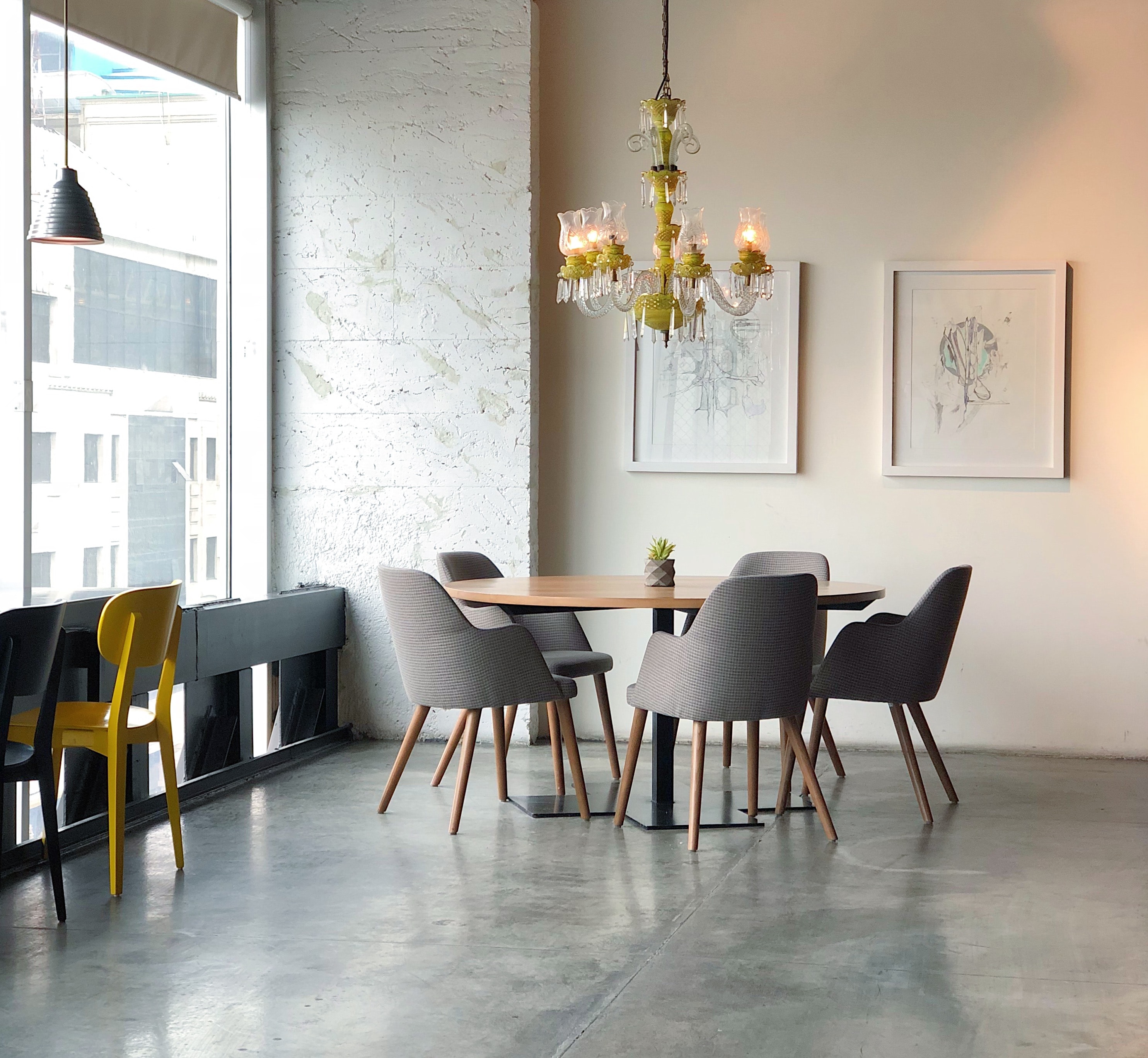
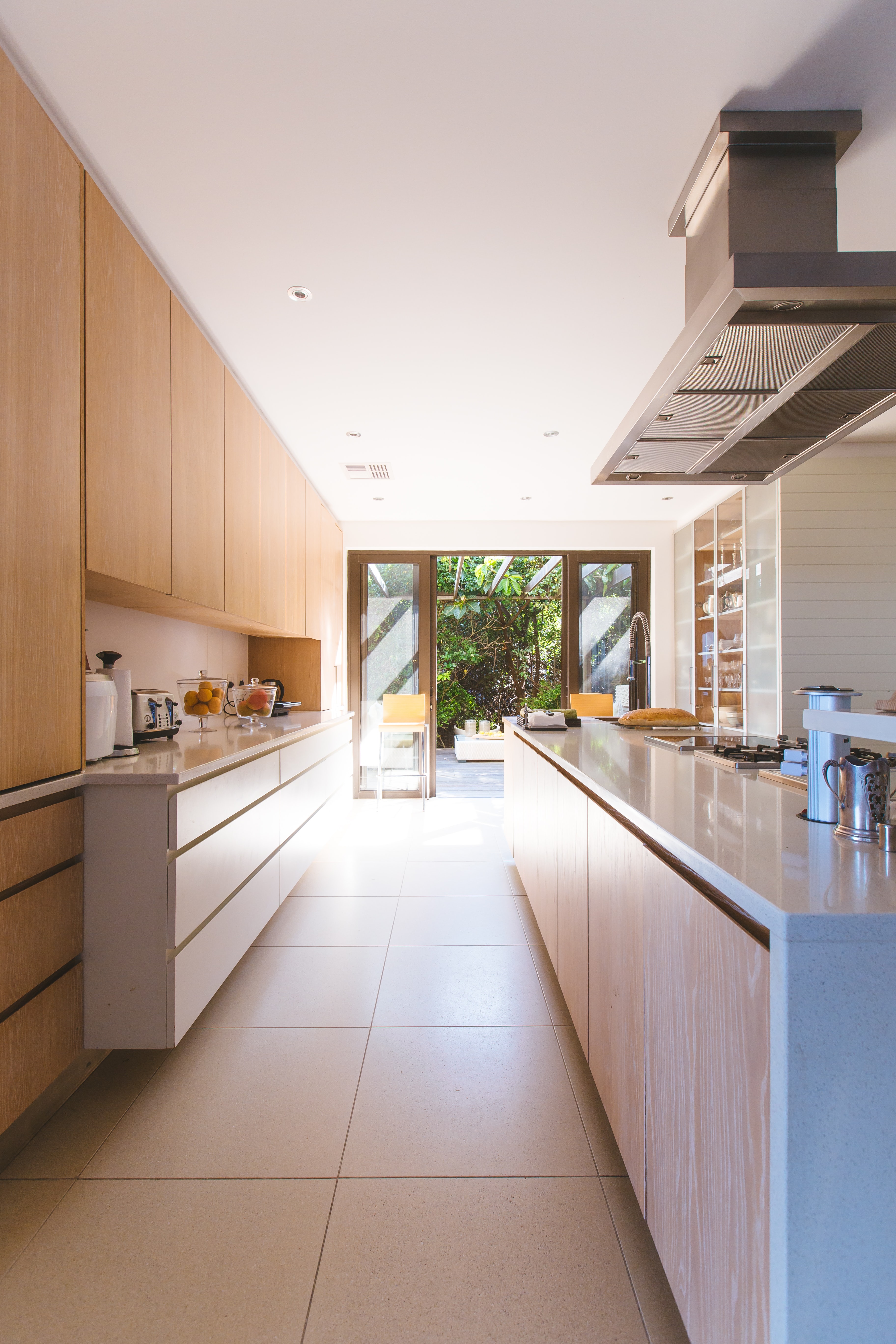
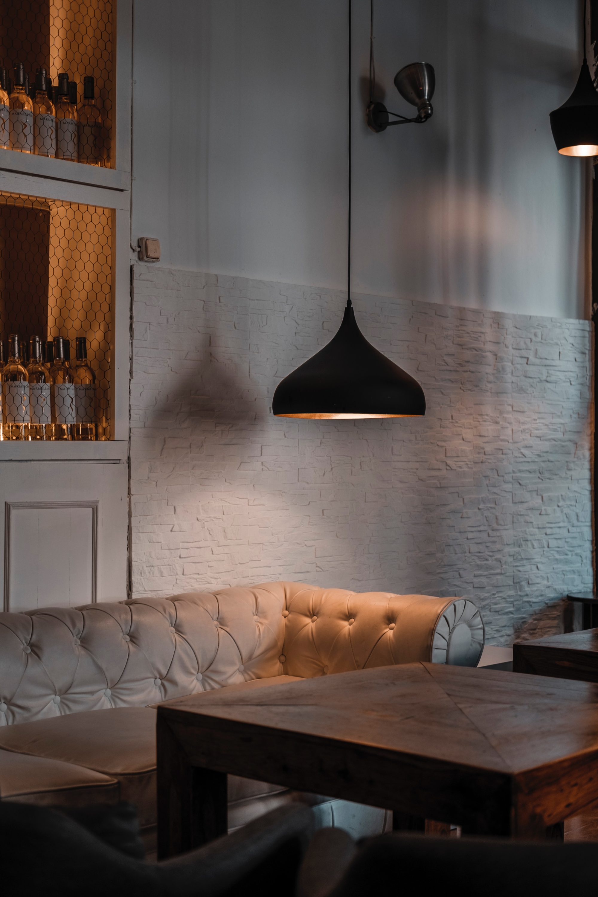
The elements and principles of design are the first things you learn when studying interior design at a university. Once you know these like the back of your hand, they will automatically become a part of your thought process when you are designing. Think of them as guides to help you know what you should be thinking about when creating a space. They are not rules that must be obeyed at all costs – they are tools to help you build a strong design. Let’s start with the seven principles of design.

Principles of Design:
The principles of design are used to measure and define design, and are often described by using the elements of design.
-Principle of Design: Balance
The distribution of the visual weight of objects, colors, texture, and space. If the design was a scale, these elements should be balanced to make a design feel stable. In symmetrical/formal balance developing from a central axis, the elements used on one side of the design are similar to those on the other side. For asymmetrical/informal balance with an irregular axis, the sides are different but still look balanced. In radial balance, the elements are arranged around a central core and may be similar.
-Principle of Design: Harmony
The relationship between all parts of the design, which should create a sense of completeness. Think of it like an overall design theme that might have consistencies between size and color. Think of baseboard trim throughout a house, it is most likely the same style, size, and color throughout.
-Principle of Design: Unity, Variety, and Contrast
Unity is the collection of elements seen as a visually related whole. Variety is the use of several elements of design to hold the viewer’s attention, to guide the viewer’s eye through and around the work of art, and it is the tension between opposing elements such as straight and curved lines. Contrast refers to accenting a composition through light, color, texture, pattern, scale, or configuration.
-Principle of Design: Rhythm
Created when visual elements are used repeatedly to create a feeling of organized movement. Rhythm creates a mood like music or dancing. To keep rhythm exciting and active, variety is essential. Repetition of lines or shapes can create rhythm.
-Principle of Design: Emphasis
Think of a focal point, it creates importance in a space and makes other items seem less important. It can be the part of the design that catches the viewer’s attention. Usually the artist will make one area stand out by contrasting it with other areas. The area could be different in size, color, texture, shape, etc. Examples could be a large sculpture in an entryway or large abstract painting at the end of a hallway.
-Principle of Design: Scale
Comparing dimensional objects in context like the proportional size of a window to other windows, the space it is in, and human beings.
-Principle of Design: Proportion
The relationship of the parts of a design to each other and to the whole. It should create a feeling of unity when all parts (sizes, amounts, or numbers) relate well with each other.
Elements of Design:
These elements of design create every object around us. Really, nothing can exist without the combination of these elements.
-Element of Design: Space
Space may be arranged through a linear, modular, nucleus, or grid pattern. It is the area in which people and objects exist and move, establishing a relationship between human and environment.
-Element of Design: Color
Color is described by its color name (hue), its change from light to dark (value), and its intensity (brightness).
-Element of Design: Light
Light typically distinguishes the contrast creating between bright spots and shadow. Light is to define and shape spaces so people can view them.
Lighting styles include: task lighting (desk lamp), ambient lighting (recessed lights), and accent lighting (picture lights).
-Element of Design: Line
A connection of two points in a space that may be straight or curved. It can also be vertical, horizontal, or diagonal. Without noticing, your brain will connect points in space which can lead to the space feeling balanced, or not.

-Element of Design: Texture
The tactical or visual quality of an object.
Adding textured elements in a design is great for creating depth and contrast.

-Element of Design: Shape and Form
Shape is two dimensional, and form is three dimensional. Shape is created by other elements of design such as color, lines, or texture. Form will most likely be objects with a three dimensional composition.
There you have it, now you know what all of the elements and principles of design are! Start referring back to these elements and principles of design as you begin the process of creating spaces. While these are not typically things a client would actively think about while in a space, all of these elements and principles affect how a space feels and how it is perceived.
If you have any interior design tips or questions, leave them in the comments!

Read Next: How To Decorate Your College Space

